ExoCharts has helped me quite a lot to consolidate my edge, so that’s why I’ll be going over the tools I’ve found the most useful. I don’t really want to dive into each of the indicators etc. since some of them are already explained in previous articles, though.
For you to understand if you need their tools, I need to describe the ideal ExoCharts user — it’s clearly not made for everyone.
- You trade BTC/ETH. If you have dxFeed and are a traditional trader, it’s also good for you
- Mostly LTF: day traders and scalpers. Also decent for HTF, but I don’t see that strong of a use case.
- Maybe obvious, but you already have a decent knowledge of the market.
Net Longs/Net Shorts
I’ve written about OI previously, and I admit it is sometimes misleading.
- Maybe there’s 1 long + 1 short opening
- Maybe there’s 1 long + 1 short closing
- Or 1 long opening + 1 long closing
In the first scenario, OI goes up. In the second one, it stays flat. And in the third one, it goes down. With NL/NS you can exactly see how each side is doing.
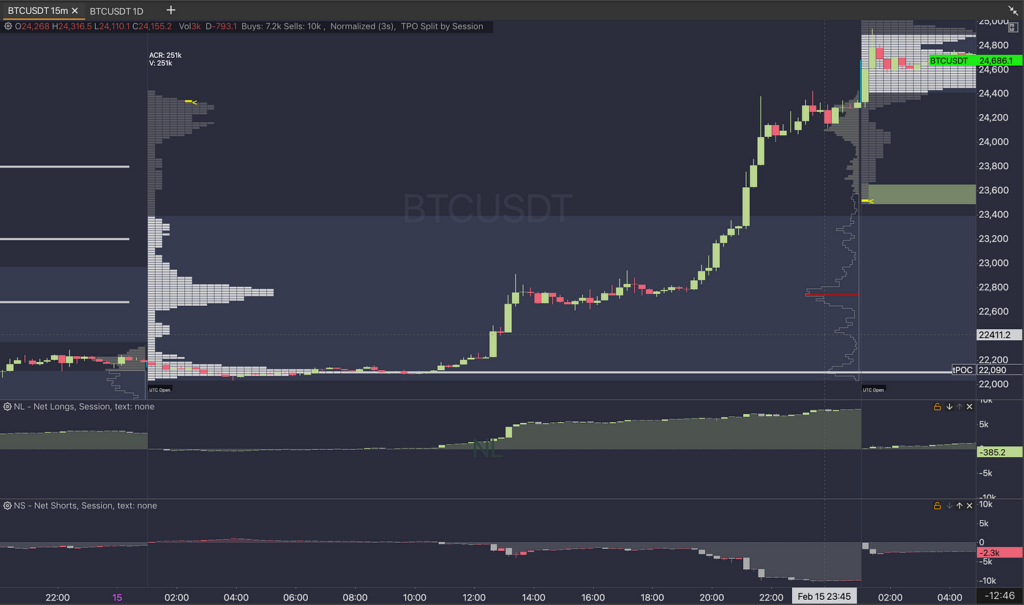
For example see in this chart how in the first leg up most longs are opened + shorts not puking, whereas in the 2nd leg up of the day there are way more shorts puking and less longs opening. OI alone gives you hints but NL/NS shows a clearer picture.

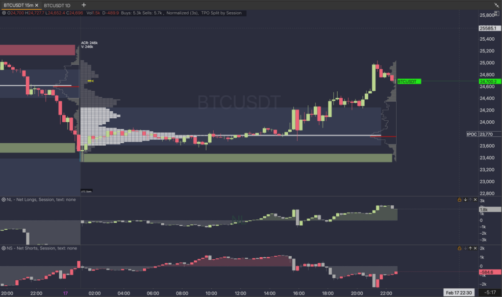
I pay attention to moments in which these are not almost inverted (like in the pic below), but cases like the chart above.

Time-Price Opportunity (TPO)
Like Volume Profile, but shows how many candles have been at a certain price. I like to think it’s a ‘simpler’ VP (most times not always, though, PoC/VA can diverge).
I like to use single prints (SPs) as a sort of more mechanical rule for my entries, similar to the session gaps we can see in stocks, for example. However, I haven’t found a real use for the green/red zones (called Buy Tails and Sell Tails), so that leaves us with just the ones located between high volume nodes
Depth Of Market (DOM)
I’ve been trying to use for really low TF on high volatility environments and I can say it can work pretty well to stop exhaustion on 1m trends, by identifying which side plays the passive side and which one the active one.
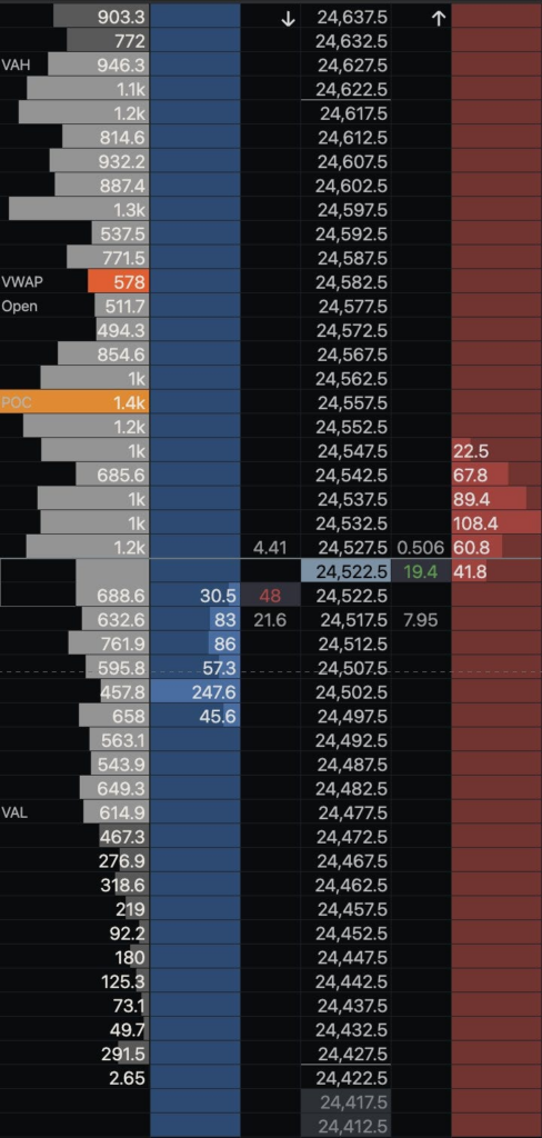
Here we can see price in the middle, then at both sides, market buys and sells at each price. In blue and red we see the order book (limit orders). Finally on the right side there’s a session volume profile.
You can add more stuff to it but this is how I have it set up.

If this was a higher volatility session and not a Saturday, I’d check if market buyers are opposing any resistance to the sellers. There’s not a lot, 48 BTC vs 19.4 BTC, so I can suppose the short side is stronger. Now if that 48 BTC was 10, and 19.4 was 1, I would be able to assume the red candle is more illiquid and there’s not that much real selling pressure.
As I said, this can change direction quickly, and most times fees would eat up your profit. I only use it during really volatile moves (several hundred $ up/down in a few minutes) and keep the trade open until the buying/selling pressure is not as visible anymore.
This is a summary of what I’ve understood until now. By no means I consider this an exhaustive article, hence I mentioned I might elaborate on TPO/DOM in the future after I gather more knowledge.
Finally, ExoCharts has more tools than these, but I haven’t used them for my trades so far. I do hope this served you as a guide and demonstration of what can be done with it. Thanks for reading!
